Dear Friends, Printers,
I would like to tell a story.
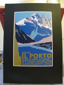
I sent my entry form to FESPA Awards, and I show it:
“Inspiration
Children are mesmerized by the illustrations of old fairy tale books. I, too was enchanted by that lively, colorful world and could not put these books down or avert my eyes from the picture. The reminiscence of undulating lines, mythical creatures and bold, otherworldly colors stayed with me until adulthood.
As a screenprinter, I was also amazed by the technique and realization. Getting to know the secret of graphical appearance and color scheme of fin de siécle prints: that was my goal. Besides my own research, Guido Lengwiler’s monograph A History of Screen Printing was a big help in reconstructing the old Selectasine printing technique.
Technique
The Selectasine Co. presented a new, unusual solution to make multicolor printing more cost-effective in December 1915. Although this technique doesn’t compare to the speed and efficiency of modern day processes, it lends a unique vibrancy to the prints made by using it. The Selectasine method helped to create an expressive, colorful world on paper.
Until the introduction of the Selectasine method, printing screens were made one by one for multicolor prints and screen printed images only amended other print products. This was way too time-consuming and expensive: furthermore, it’s nigh impossible to create as many screens as many colors one would like to use and hand-paint all of them, and also make each color block fit the print. With time, screen printing became more autonomous and expanded its use and functionality, thus making the development of time-saving and cost-effective techniques imperative.
The method of Selectasine Co. is based on a single printing screen in that all non-printing parts are blocked out after printing each color one by one. This results in a smaller and smaller open printing surface, and thick layers of ink create a patchwork-like image of overlapping patches of colors. This unusual logic is hard to retrace from the perspective of contemporary screen printing techniques, however its enchanting visual qualities are undeniable.
Hand painting, layers of inks and the hallmark style of fin de siécle graphical style create a kind of magic that are echoed by these prints.
Old and new
I wanted to recreate this magic while using modern tools and materials customary today. I found this to be an appropriate salute to our forerunners on the 100th anniversary of the introduction of the Selectasine patent. By juxtaposing modern and old, my aim was not just to reconstruct the Selectasine method, but to reflect on the technological advancement of screen printing throughout the past century. To achieve this, I let myself inspire by the ambience of old prints as opposed to pure historicism.
I created the graphic by freehand drawing, but directly on the vector graphics software’s interface. I filled larger and larger areas with color.
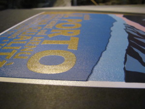
I wished to recreate the thickness of turn of the century oil-based inks by modern plastisol ink, as it retains its thickness after heat treatment.
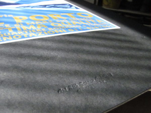
The printing surface is also quite unique. It’s dominant presence serves as an ideal base for the seven layers of inks and their coating thickness. It’s a 2 mm thick deep black paper, that acts as a final printing surface, as opposed to modern-day plastisols’ typical use as heat transfer inks on transfer paper.”


Very lovely, and I enjoyed your description. It makes me want to see this print in person.
Interesting. I have been screen printing this way for many years, and have referred to it as “reduction” screen printing.
Elizabeth
http://www.ebrinton.com