During this unfortunate time I am attempting to thrash out reduction lino print. During a workshop session I was asked ‘Why do you print light to dark?’ and the only answer I knew was that it is more forgiving , laying a darker colour over a lighter one. So I am now in the process of printing an reduction dark to light. I have a drawing on the plate in biro and no other reference. I don’t have a coloured sketch or any plan, this is just me getting lighter apart from the first colour which I chose to do the sky so that I can cut a visible shape, Image 1 blue.

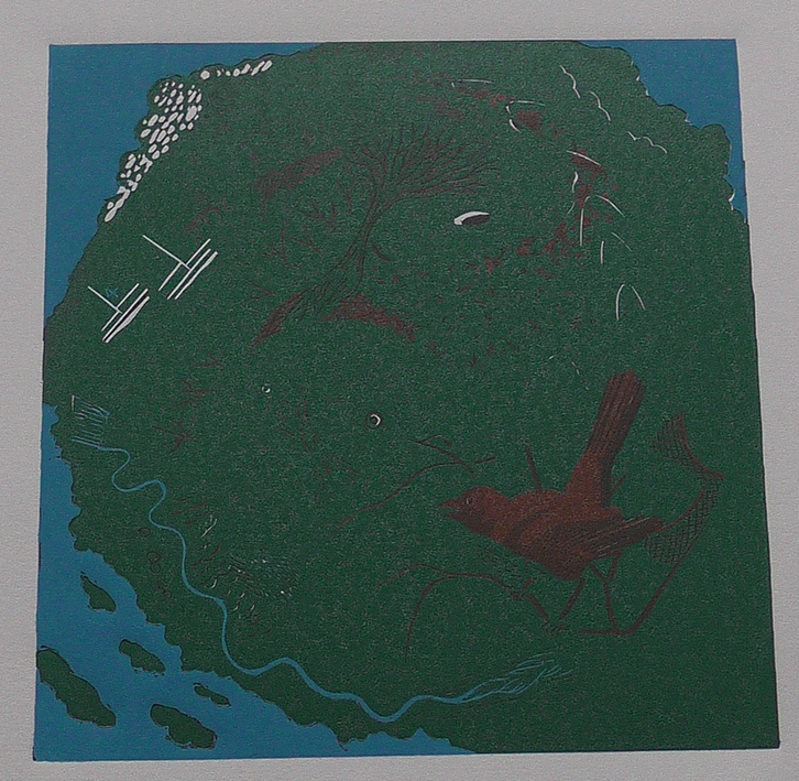
Image 2 we can see clearly this colour is tonally much darker. I noticed that the colour had picked up with the blue and turned it a shade or two greener that the brown I had mixed. I wasn’t too fussed by this but I have made a note and will adjust the following colours as I go on.

The third image, this was a dark chestnut brown and pretty much stayed as mixed. I noticed at this stage that the greener brown of before had darkened slightly and gone bluer next to this colour. I was happy with this because I originally thought the other was too green for a dark brown black, now it seemed to sit well. Sorry about the composition of the photo it should be one edge turn anti clockwise.

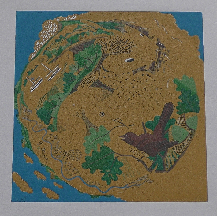
Fourth image a lighter chestnut brown, I felt I had missed this, not enough contrast, the darker chestnut was leaving a ring around the clouds and registration was slightly off on some prints. Normally this might get covered with a moving towards a darker colour, we will have to see what happens moving towards lighter colours, will it come through or alter the edges of objects?
I have only got the fifth image where I have changed the colour to green as I am going to get some of the trees in and possibly a leaf or two. The bird is looking ok it will look fuller when the breast is in. Not meaning for this to be an exact copy of life but to be somewhere in-between but not a cartoon. With the green on the brown around the clouds stands out, this isn’t due to cutting it is a registration thing. I am using Terns Burton Pins, but being isolated I am working in a confined domestic space where things easily get knocked.
Image 6. after pushing that green in the forms I had been working on came to life and things became clearer. Moving back to the browns I might have to flip from one to the other. The darker colours effect the next layer more noticeably than working light to dark. I also think that the dark colours have been pretty close to each other so I am going to do a test with photoshop. I will grey scale all the images and see how they look tonally.

The seventh image, this yellower brown is informing me about what I want the fish to come from, I am now thinking fresh water maybe golden carp or trout. This played well on the last brown without too much change. The colour of the river is highlighting the way colour is effected by that around it.
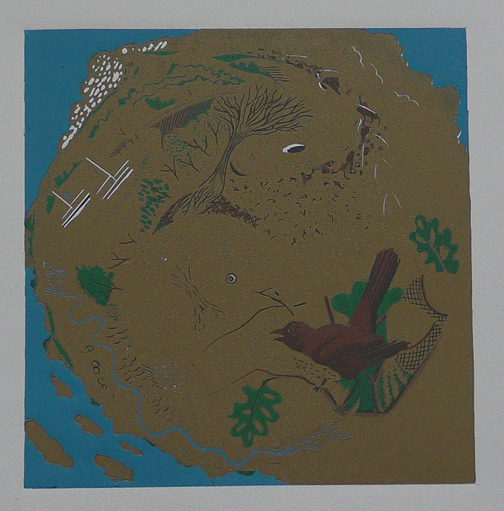
Image eight is meant to be an ochre/ golden yellow still a little dark and I think the lighting in the flat (natural) is effecting the true representation, its looking a bit pink in the photo. Pleased with this and feeling like I need to go back to the greens.
Image nine back on the green, I have come into a registration problem, the image seems to have moved on some, the golden yellow brown has started to peep through in some pictures. I have also found it difficult to stay close to the tone but to also move on through the print, I am enjoying the constant questioning and not knowing the answers.
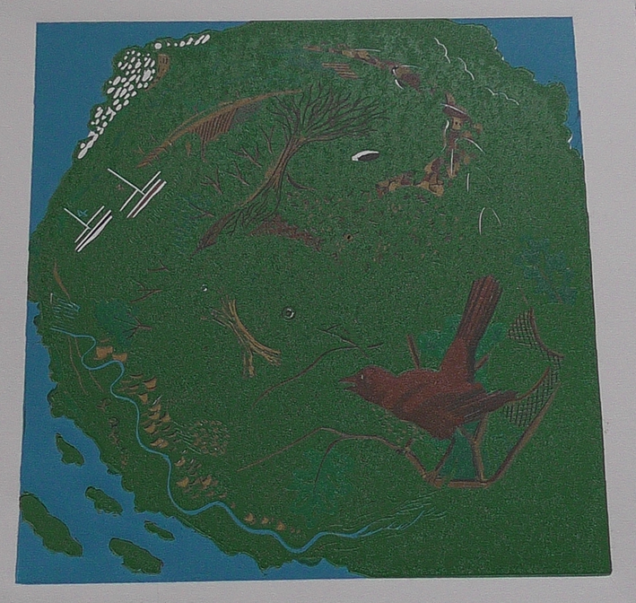
Image ten putting this green on has cheered me up the registration (touch wood) isn’t too bad I might get away with it. It is also brighter and lighter and the next green has been mixed ready.
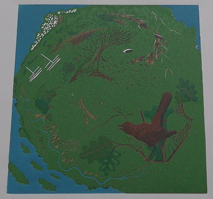
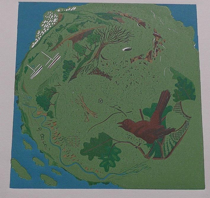
Image 11. Working lighter back on the greens I am still finding it difficult to gauge the tone and the value of the colour. This green is sharper more yellow but adding the white has brought the greys into it. i know it will push the darker greens back and give them a boldness.
The twelfth image although it looks darker in the photograph I think that is just the lighting in the flat. It is lighter and yet it is so close to the last green it is really subtle on the print. I like this as it will bring a quality to close inspection from an audience.
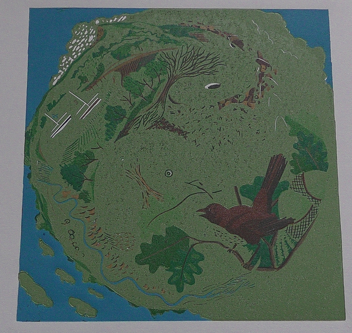
Image thirteen I am moving into oranges I knew the green under the first layer would suggest a brown and I was hoping I could use this to increase the pebbles in the water. I have mixed three parts yellow to one red and it was a really vibrant orange in the packet, I will include a picture of it.
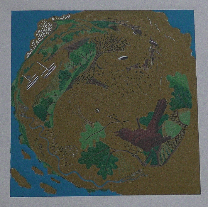
Image 14 Adding one red to two yellow and one white bringing a grey into the orange.
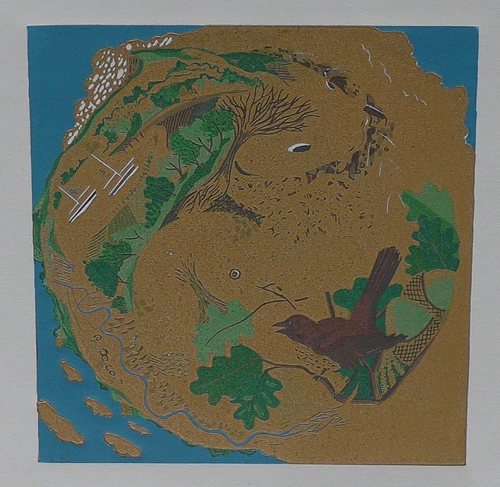
Image Fifteen reducing the amount of red against the yellow and adding equal white to yellow this orange is moving closer to yellow. The idea is to try to get to a place where the yellow/ white sun radiates out through the tree. Not really visible in the photos but as it gets closer to the finish it might pop out.
This is as far as we go for now I will be looking to complete this by the end of the month.